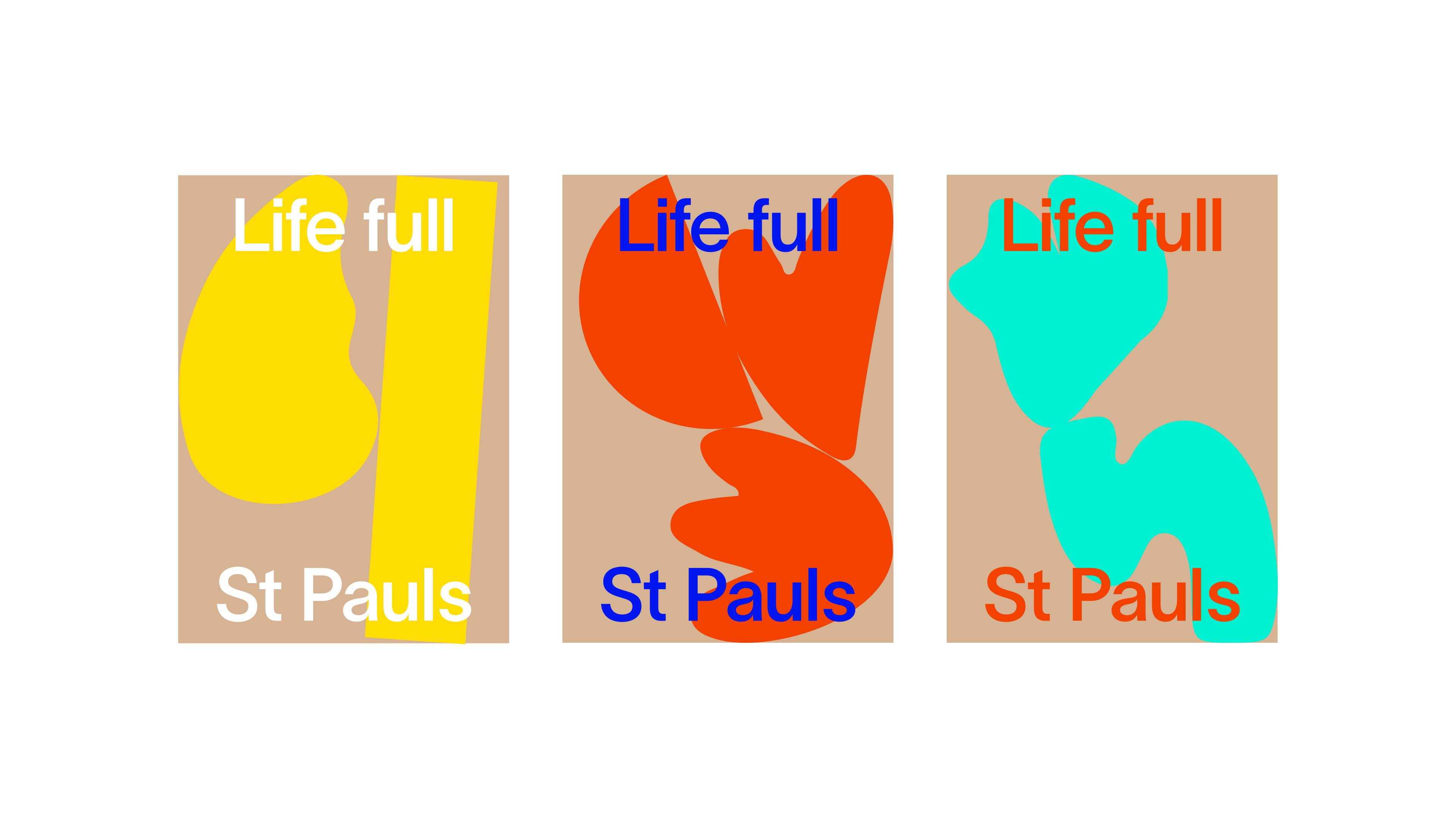
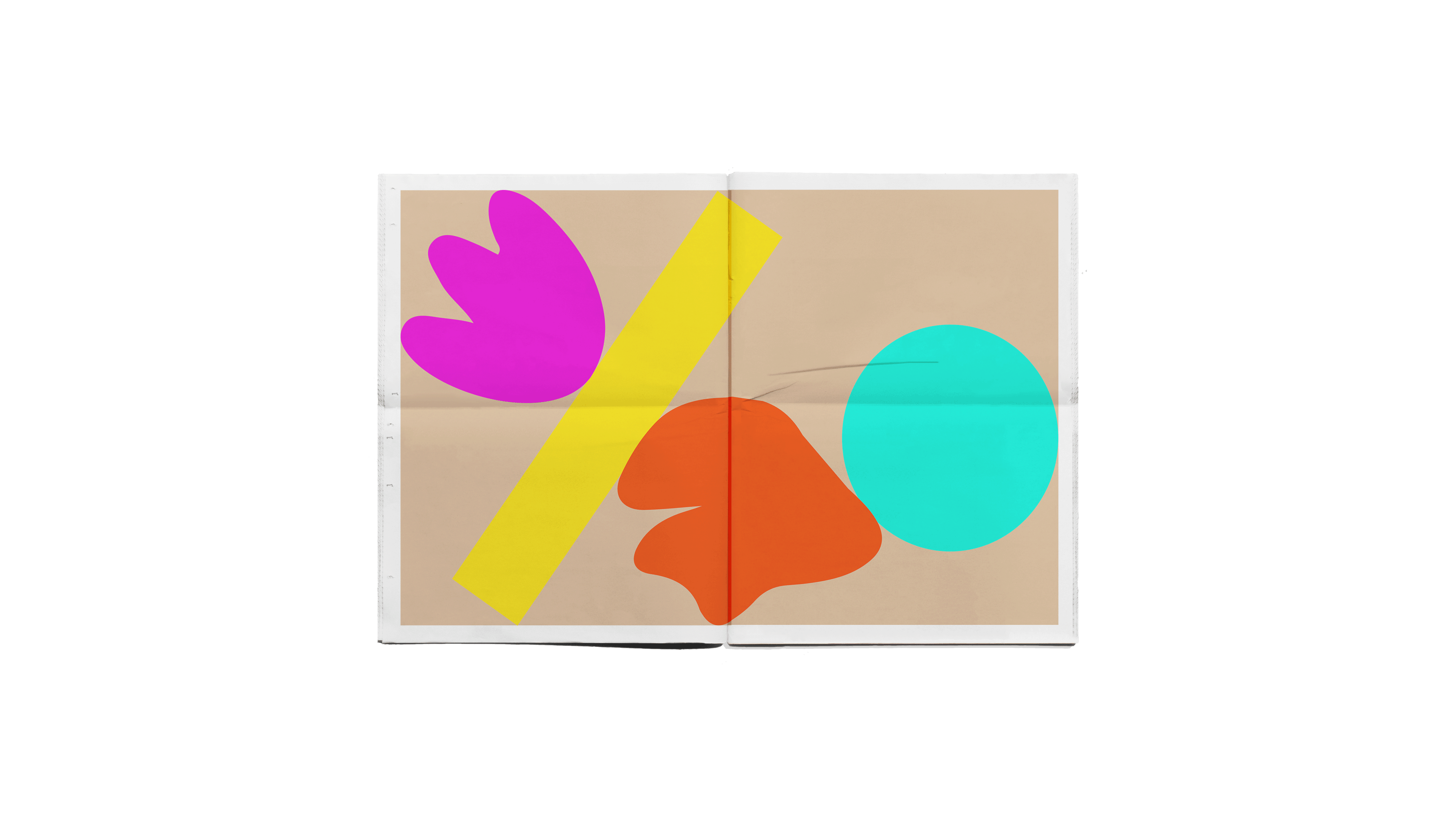


St Paul’s are a small primary school in Cambridge. Their values are honest and heart filled with the children’s learning and self exploration at the forefront. To reflect this, an identify using a mix of geometric and organic shapes was created and paired up with a vivid colour pallet to appeal to the young audience.
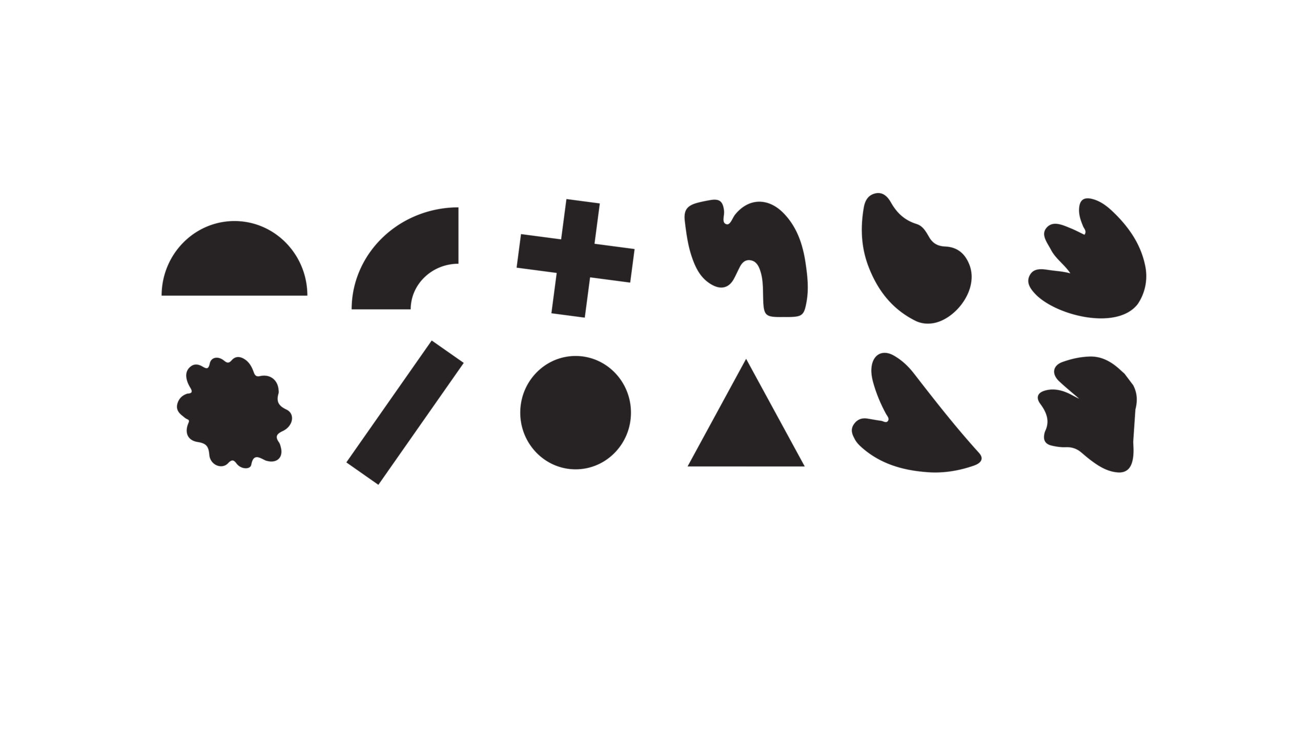
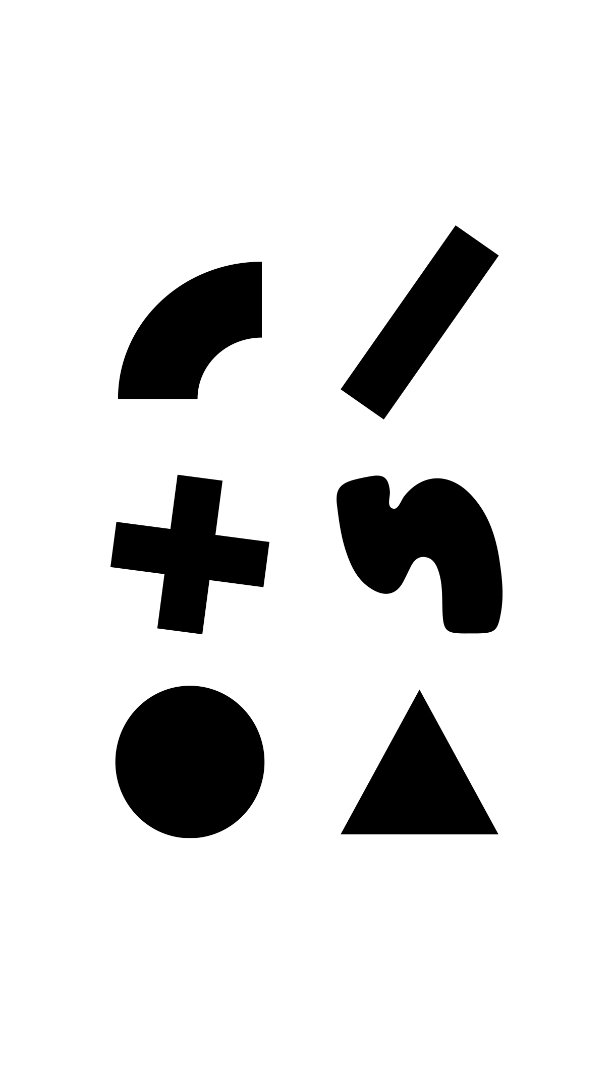
Whilst designing the shapes, my vision was to illustrate the diversity of subjects that children are exposed to at Primary School. Geometric shapes represent the academic subjects, whilst organic shapes represent art, music and nature.
It was clear to me from the start that animation would be a prominent element for this project, given the playful nature of the graphics. Gravity is simulated to spring life into the shapes as they bounce amongst each other.
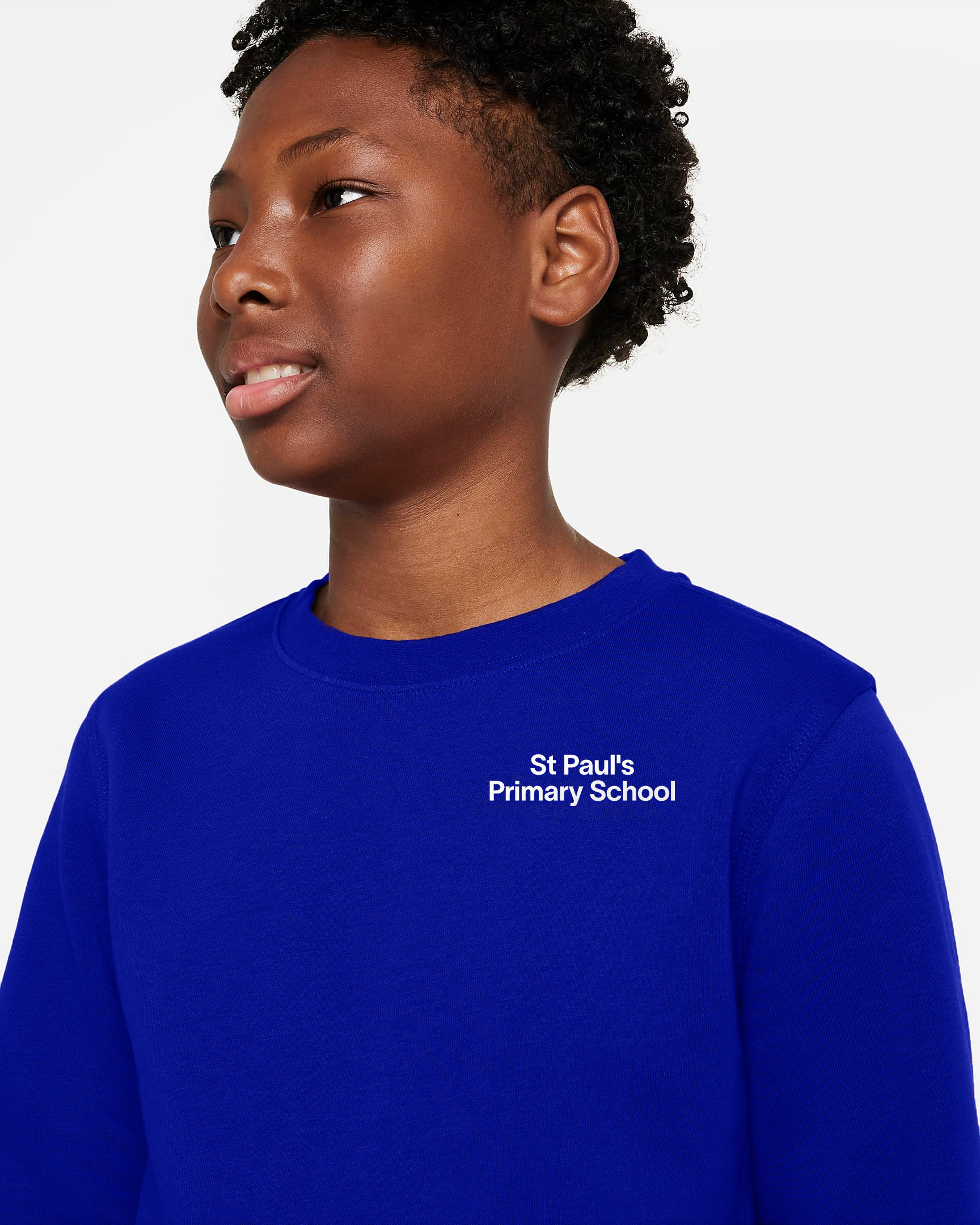
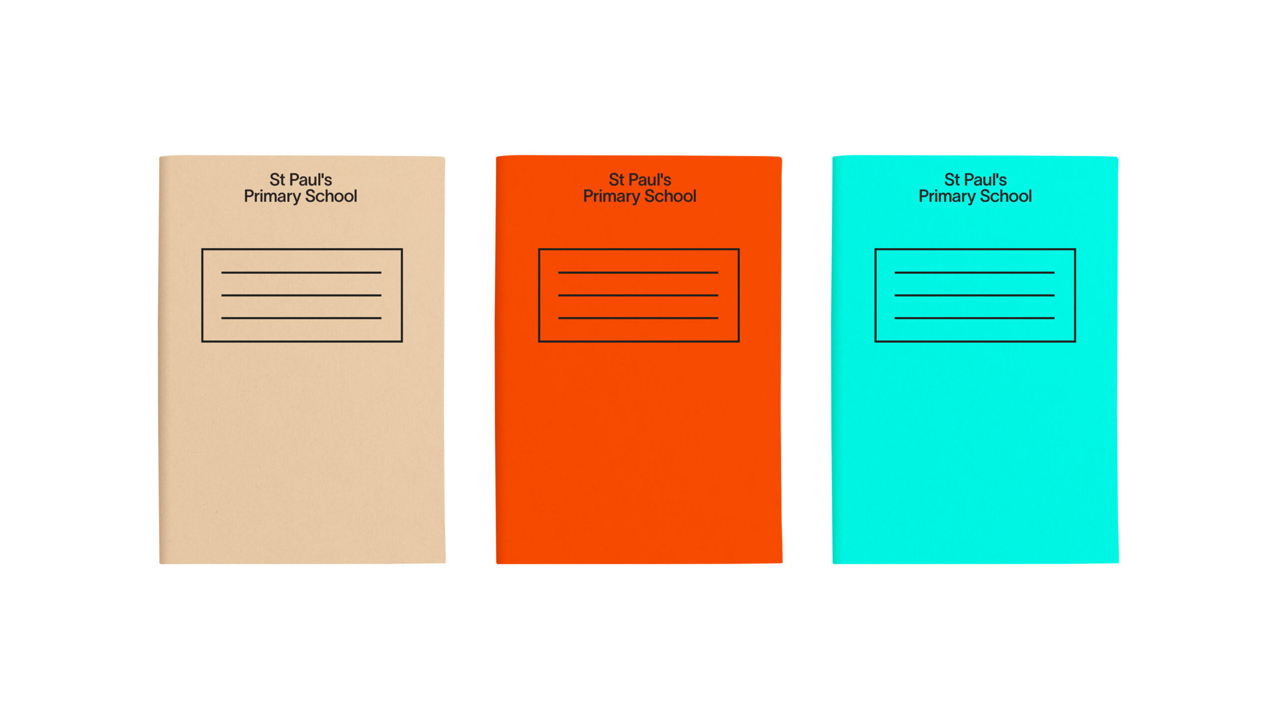
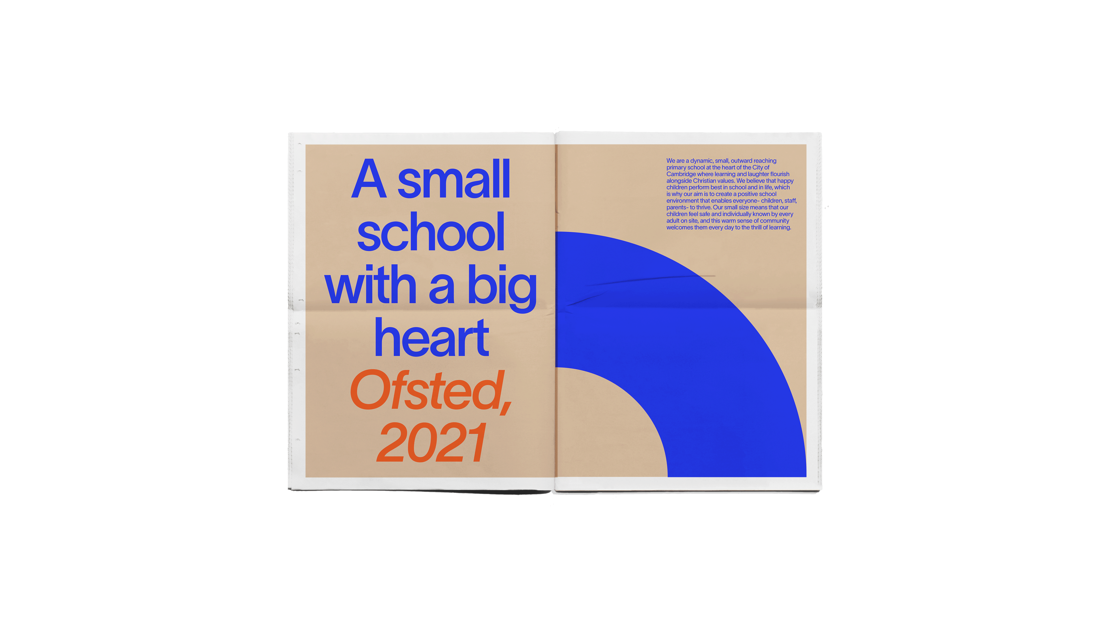
St Paul’s Primary School